The Problem with our Original Branding
The start of something. We love our branding still but to pave the way, a good bye is necessary.
Our Branding's history
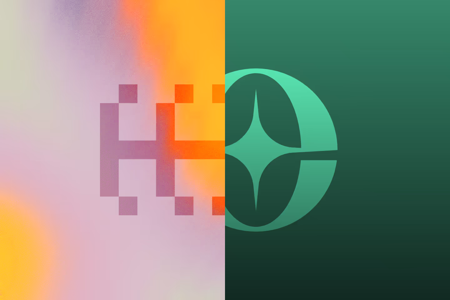
The original direction and meaning behind our logo
To think of the direction of the brand, it took us one draft session of 3 hours and a couple more hours to sketch things out in preparation. That was fast, much faster than what we usually spend for our client's projects. Maybe because it's something we love, something we already have in our head. Who know.
The idea was from our first thought of making waves, lasting result, hence the "ECHO". Echo actually can be understood in 2 ways:
- The first is the most common understanding of the word. Meaning a repitition of sound caused by reflection of sound waves off a surface. Yes we used Google for this definition. But isn't it cool to hear your voice echoing back? Being a kid, standing in front of a cave, and the voice coming back to us, a wonderful childhood experience. Experience that will last for a long time in your memory. Which is what we are trying to achieve.
- The second understanding of the word is being reminiscent of or have shared characteristics with someone or something. Also something that we strive to do as to understand our clients from their point of view.
The Branding surrounding
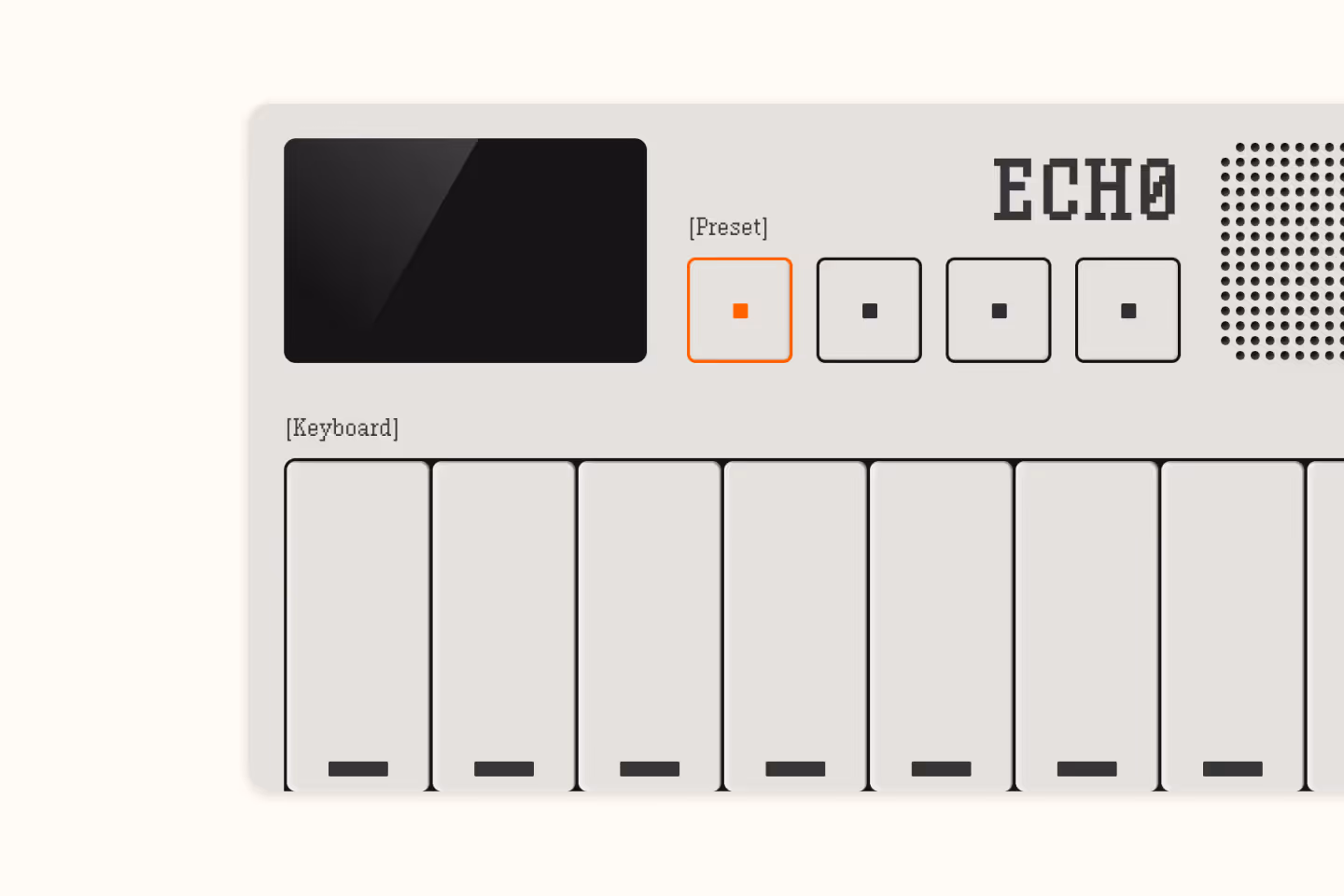
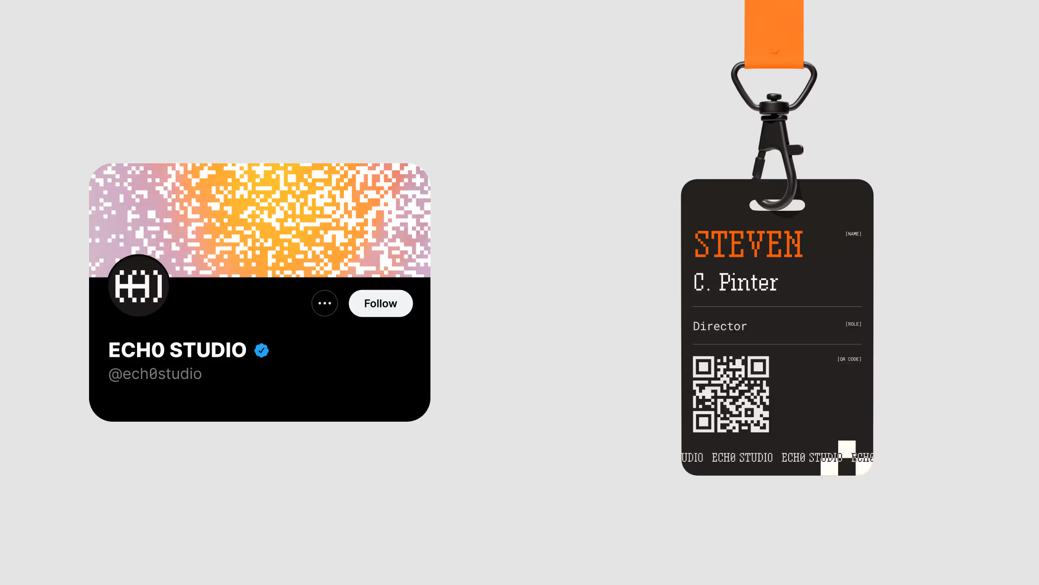
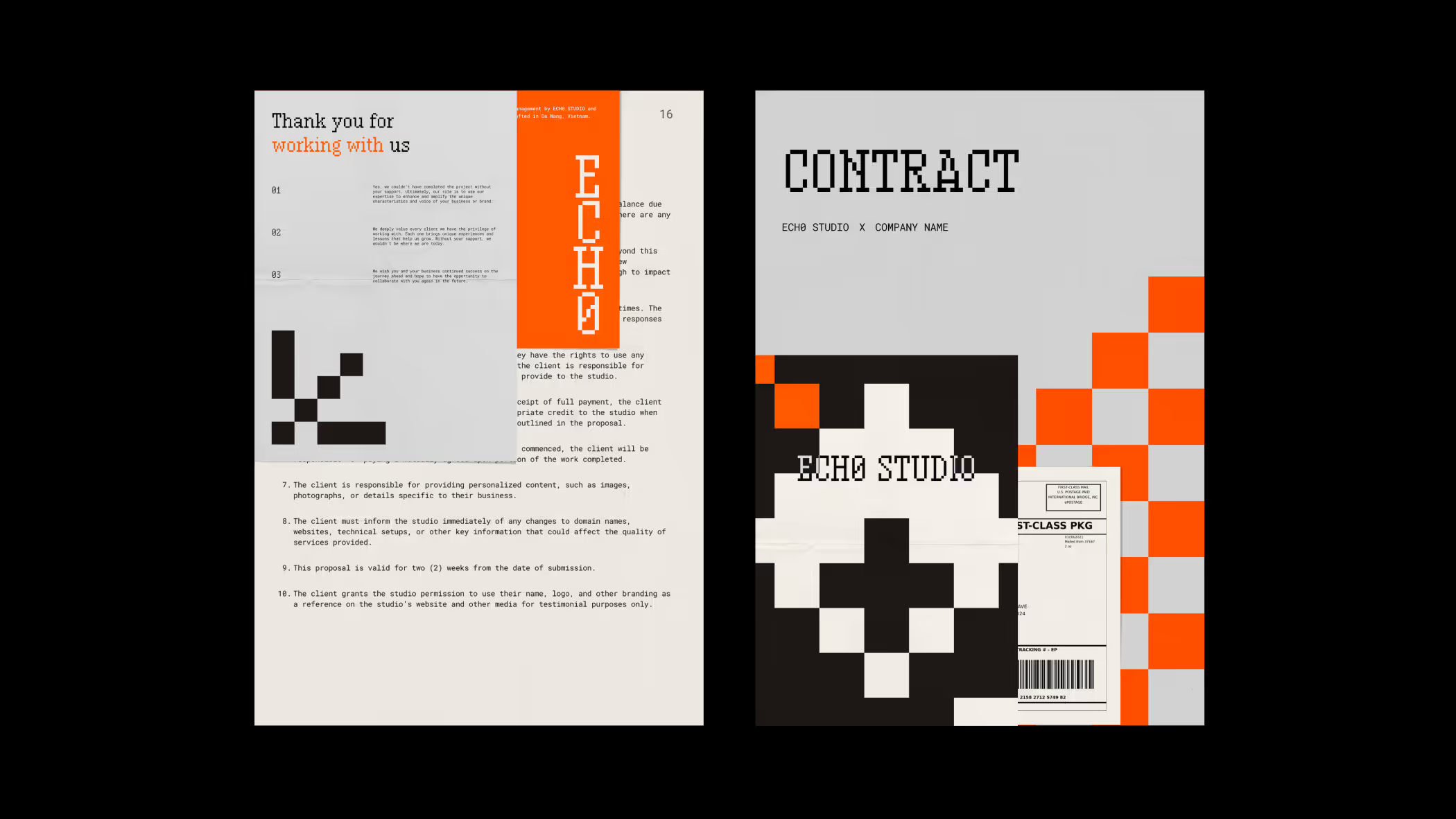
For the branding, we wanted to come up with something that share same characteristics with sound.
- Our main graphic is an imaginary keyboard which user can interact with to play simple notes or preset right on web.
- When thinking of sound, we think of those MIDI keyboards, and designs from Teenage Engineering (Shout out to Teenage Engineering, their designs rocks!). And those mono font, pixel look comes naturally.
- For most of our document graphic, we choose various gradient backgrounds with pixels scattered for a "disruptive" look.
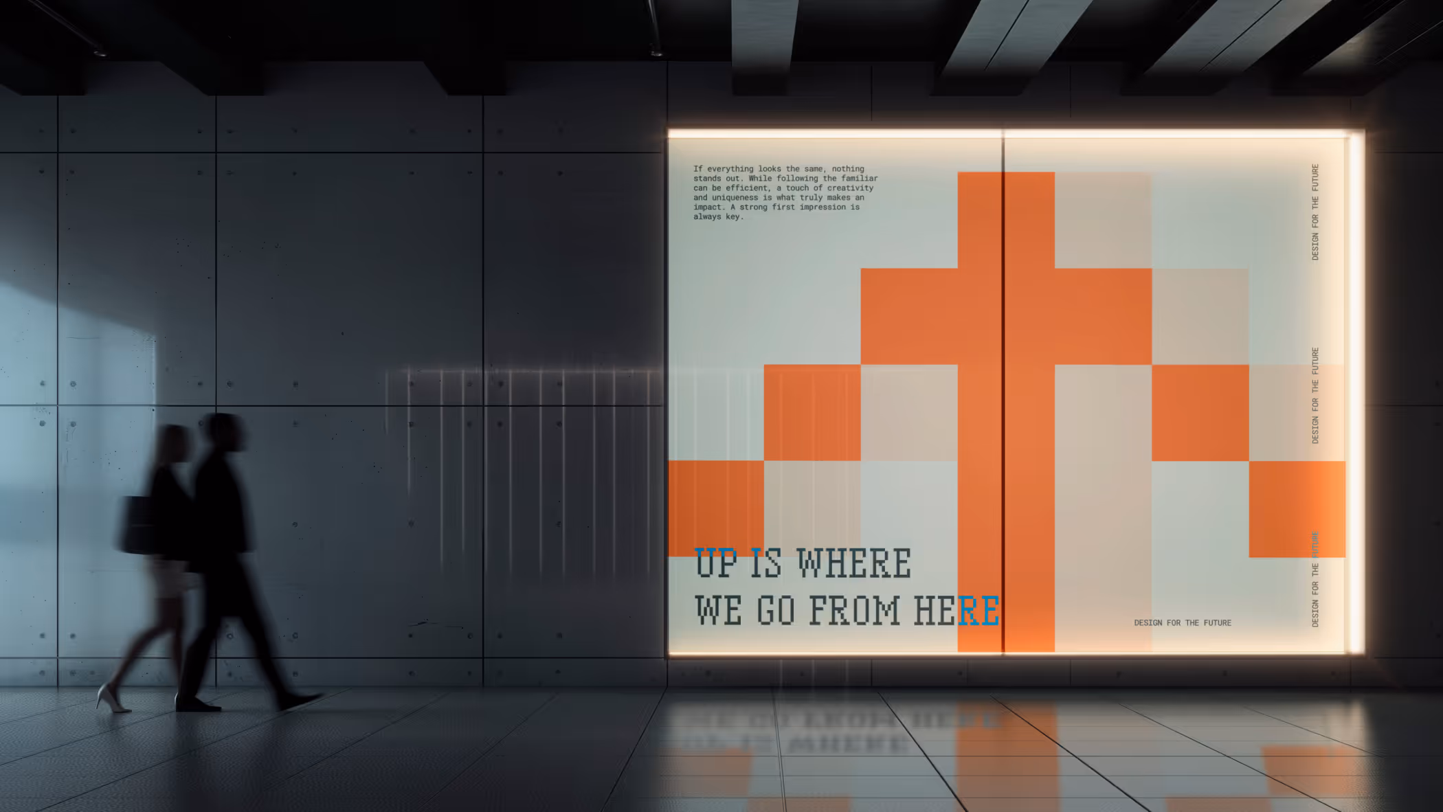
See some of our graphics below:
See more of our original branding in our showcase ECH0 STUDIO: From a Pixel | Brand Identity :: Behance
Or you still can access our old website from Made in Webflow:
Problem arises
As much as we love our original branding, we can not stress this enough. As we continue and look forward, more and more things and this branding shows limits.
- It's too bold! You heard it right. It's too bold for our direction ahead. Although, we love being bold and be the difference. As we changed our direction and cater more to small and mid-sized businesses, being too bold is not a good strategy, not a sustainable strategy.
- User experience balancing. A part of being bold is to break the norms. That mean some parts can be harder for user to consume. This shows clearest on our website, as we experiment with layouts.
- We are a small business ourselves! We want a branding that can be easily expanded and changed, a branding that can last us a couple years. We understand small and mid-sized businesses struggles as we experience them ourselves. Budget changes, direction bends,... stuff happens and we need a better, more solid base to move forward, or sometimes, take a step back when needed.
The problem mainly comes from our change in direction. We are changing our services, models, and process to cater more to small, mid-sized businesses like ourselves. Because we believe, every business has to start from somewhere. And it better be a solid base to start with. Which we can help.
Wait, it's not ECHO but ECH0?
Moving away from the original branding does not mean that we gave up on being bold on our designs. And yes, our name is actually "ech0", Echo with a Zero.
You might find it cringe, or unnecessary. But for us, we think being difference is the key to stand out these days. That's why on our works, we always try to sprinkle some special stuff that make our client's designs bringing out their branding's characteristics. Difference does not need to be a totally new thing, something the world never have seen before. Difference can be on really delicate, tiny stuff that we will help you and your business to find out.
Ech0 or Echo with a Zero. Yeah, that's our name alright.